 |
clearString neatComponents
|
|
clearString neatComponents A Horizontal navigation bar |
 | ||
 | Application Development |  |
A Horizontal navigation bar | ||
 |  |
To illustrate how to configure Navigation to look the way you desire let us look at how the top navigation in an example website was created. Here the sections are simply called A,B,C ...

This is a simple text navigation placed in specific location on the website in relation to some Images and blocks of color.
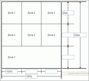
 Step 1. To get the Navigation to display in the correct location on the page, you first use the Layout Manager and adjust the Zones in the top layout element to have the desired characteristics. In this case the design of the website calls for an image in the top left, a different image across the head of the page. The navigation is to be centered on the page, on a light gray background.
Zones 1, 2 and 3 have been left 'Empty' for future use (if required).
Zones 4 and 5 have been set to 'Image' and an appropriate image has been uploaded using the built-in image edit tool in the local menu..
Zone 6 is 'Empty' and set to be light gray using the Edit Zone Style tool in the local menu.
Zones 7, 8 and 9 have been combined. The resulting Zone 7 has been set to 'Navigation'.
Step 2. We want the Navigation to be centered on page, with black text in Verdana 8 point, mouse-over to blue, and be blue and bold when selected.

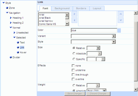
Using the Zone Edit Style tool we made the following settings.
Zone | Background | Background color [#f1f1f1]
Zone | Layout | Text Layout Alignment [center]
Normal | Unselected | Text | Font settings
Font Family select Verdana and promote to the right
Color Black
Size Specific 8 pt
Weight Relative
Normal | Unselected | Link A | Font | Color: [black]
Normal | Unselected | Link A: Hover | Font | Color: [blue]
Normal | Selected | Text | Font | Weight: Absolute [Bold]
Normal | Selected | Link A | Font | Color: [blue]
Normal | Selected | Link A | Font | Weight: Absolute [Bold]
Divider | Layout | Scale [10 px]
Copyright © 2026 Enstar Systems Inc. All rights reserved |
